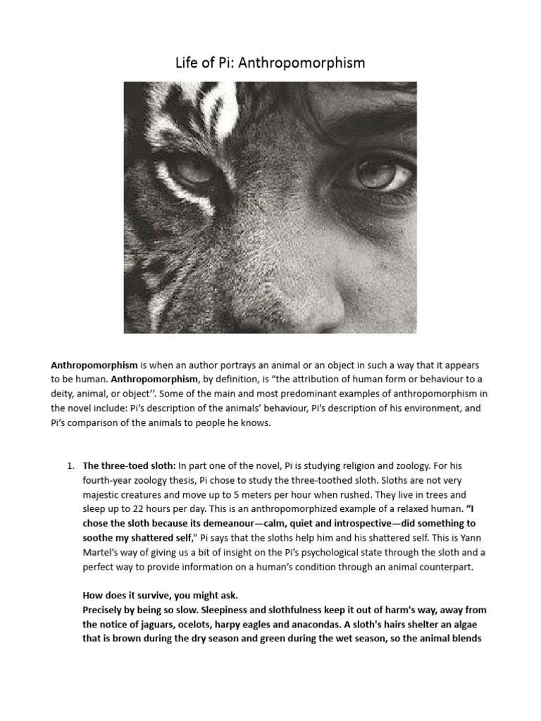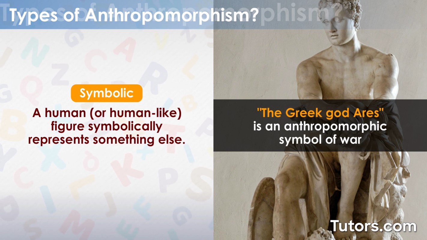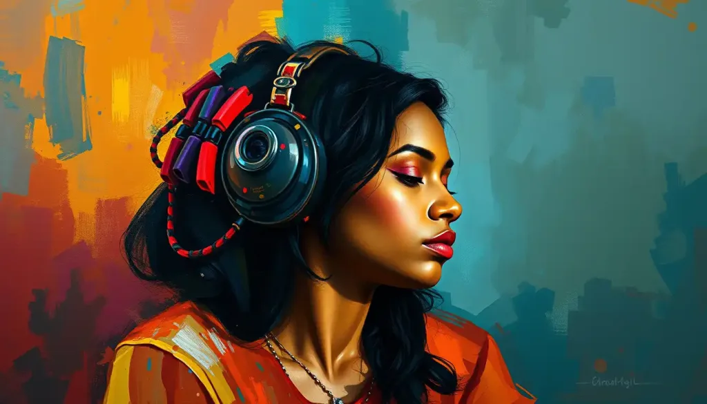
In the vast spectrum of human perception, few phenomena are as universally captivating as the way we imbue colors with life-like qualities. The psychology of anthropomorphic color schemes—where hues are not merely seen but *felt*, *acted upon*, and even *personified*—reveals a profound intersection between visual stimuli and cognitive empathy. This fascination transcends mere aesthetic preference; it taps into an ancient, almost primal tendency to anthropomorphize the inanimate, to see intention and emotion in the abstract. Why do we instinctively describe a “cheerful yellow” or a “mournful gray”? Why do certain colors evoke narratives of vitality, melancholy, or aggression without a single word being spoken? The answers lie in the intricate dance between neurobiology, cultural conditioning, and the evolutionary wiring of the human mind.
The Alchemy of Perception: How Colors Become Characters
At its core, anthropomorphism is the cognitive bridge between the unfamiliar and the familiar. When we attribute human traits to colors, we are engaging in a form of embodied cognition, where abstract visual data is translated into relatable emotional experiences. Studies in color psychology suggest that the brain processes hues in the context of past experiences, memories, and even physiological responses. For instance, the warm, golden glow of amber isn’t just a wavelength of light—it’s a visceral reminder of sunlight, fire, and the comfort of hearth and home. Conversely, the sterile, clinical white of a hospital corridor can evoke feelings of isolation or sterility, not because of the color itself, but because of the associations it carries.
This phenomenon is further amplified by the synesthetic potential of color. Some individuals, through a quirk of neurodiversity or learned association, may “taste” a color or “hear” its emotional tone. For the majority, however, the anthropomorphism arises from a more subtle process: the way colors mimic the emotional expressions of the human face. A bold red might “shout” urgency or passion, while a muted teal “whispers” tranquility. The brain, wired to detect subtle cues in facial expressions, extends this sensitivity to chromatic stimuli, effectively “reading” colors as if they were silent, sentient beings.
The Cultural Palette: How Societies Paint Emotion
While biology lays the foundation for our emotional responses to color, culture acts as the artist’s brush, layering meaning onto the canvas of perception. Anthropomorphic color schemes are not static; they evolve with societal narratives, religious symbolism, and even political propaganda. In Western cultures, white is often the harbinger of purity and innocence, while in parts of Asia, it is the color of mourning—a stark contrast that underscores how deeply anthropomorphism is rooted in collective memory.
Consider the color green. In many Middle Eastern traditions, it symbolizes fertility and renewal, while in Western contexts, it is synonymous with envy (the “green-eyed monster”). This duality reveals how anthropomorphism is not merely a personal quirk but a shared language. Brands leverage this phenomenon masterfully: the “friendly” blue of a social media platform, the “bold” red of a fast-food logo—each hue is a deliberate character in the story a company wishes to tell. Even language reflects this tendency; we speak of “cool blues,” “warm reds,” and “sad grays,” as if colors possess the emotional depth of a Shakespearean protagonist.
The Neuroaesthetics of Chromatic Empathy
To understand why we anthropomorphize colors, we must delve into the neuroscience of aesthetics. The fusiform gyrus, a region of the brain associated with facial recognition, also plays a role in how we process color. When we encounter a hue, this area may inadvertently activate, prompting the brain to seek patterns and intentions—much like it does when interpreting human expressions. Functional MRI studies have shown that viewing certain colors can stimulate the amygdala, the brain’s emotional center, while others may engage the prefrontal cortex, where abstract reasoning and symbolism reside.
This neural interplay explains why some colors feel “aggressive” or “soothing” without logical justification. A neon pink, for example, might trigger a subconscious alertness, akin to the sudden appearance of a predator’s warning colors in nature. Conversely, a soft lavender could induce a sense of nostalgia, evoking memories of childhood or twilight skies. The anthropomorphism here is not a conscious choice but a byproduct of an evolved survival mechanism—one that predisposes us to see agency in the world around us, even where none exists.
Designing with Intent: The Power of Chromatic Storytelling
In the realm of design, the anthropomorphism of color is not a mere curiosity—it is a tool of persuasion and connection. Graphic designers, marketers, and artists exploit this phenomenon to craft narratives that resonate on a subconscious level. A children’s brand might employ pastel pinks and sky blues to evoke innocence and playfulness, while a luxury perfume could use deep, velvety purples to suggest opulence and mystery. The key lies in the semantic congruence between color and intended emotion: a color’s anthropomorphic qualities must align with the message it carries.
Architects, too, wield this power. The use of warm, earthy tones in a cozy café isn’t accidental; it’s a deliberate attempt to make the space feel inviting and human. Even in digital interfaces, the choice of a “friendly” green for a “go” button or a “cautionary” orange for a warning leverages our innate tendency to personify colors. The most effective designs are those that feel almost alive, where the color scheme breathes with the same emotional cadence as a human conversation.
The Darker Shades: When Anthropomorphism Turns Sinister
Not all anthropomorphic color schemes are benign. History is rife with examples of how colors have been weaponized to manipulate and control. The propaganda palettes of totalitarian regimes often employ stark contrasts—black and red—to evoke fear and submission. The Nazi swastika, with its bold, angular black form against a white background, was a masterclass in chromatic intimidation, designed to “speak” of dominance and terror. Similarly, the sickly green of toxic waste or the ashen gray of a battlefield are colors that have been stripped of their anthropomorphic warmth, repurposed to signify danger and decay.
Even in everyday life, the anthropomorphism of color can have unintended consequences. A “boring” beige office space might feel sterile and uninspiring, not because of the color itself, but because it lacks the emotional resonance of a more dynamic palette. The phenomenon, when misapplied, can lead to environments that feel emotionally stifling or, conversely, overwhelmingly intense. The challenge for designers and communicators is to harness the power of anthropomorphic color while avoiding its pitfalls—creating spaces and experiences that feel alive, not suffocating.
The Future: A Spectrum of Sentient Design
As technology advances, so too does our relationship with color. Augmented reality and biophilic design are pushing the boundaries of how we interact with hues, blurring the line between the physical and the digital. Imagine a world where walls shift color in response to your mood, where a “sad” room could literally change its palette to uplift you. This is not mere science fiction; it is the next frontier of anthropomorphic color design, where colors are no longer static but dynamic participants in our emotional lives.
The future may also see a deeper integration of neuroaesthetics into design, where colors are chosen not just for their visual appeal but for their neurological impact. Could we one day “tune” a room’s color scheme to enhance productivity or reduce anxiety? The possibilities are as limitless as the spectrum itself. Yet, with this power comes responsibility. The more we anthropomorphize color, the more we must ask ourselves: Are we designing for connection, or are we merely indulging in the illusion of control over the intangible?
In the end, the psychology of anthropomorphic color schemes is a testament to the human capacity for empathy—even when that empathy is directed toward the inanimate. It is a reminder that our world is not just seen but *felt*, and that the colors around us are not merely decorative but deeply, inextricably human. Whether in the quiet hum of a sunlit room or the bold declaration of a protest sign, colors speak to us in a language older than words, inviting us to listen—and to respond.