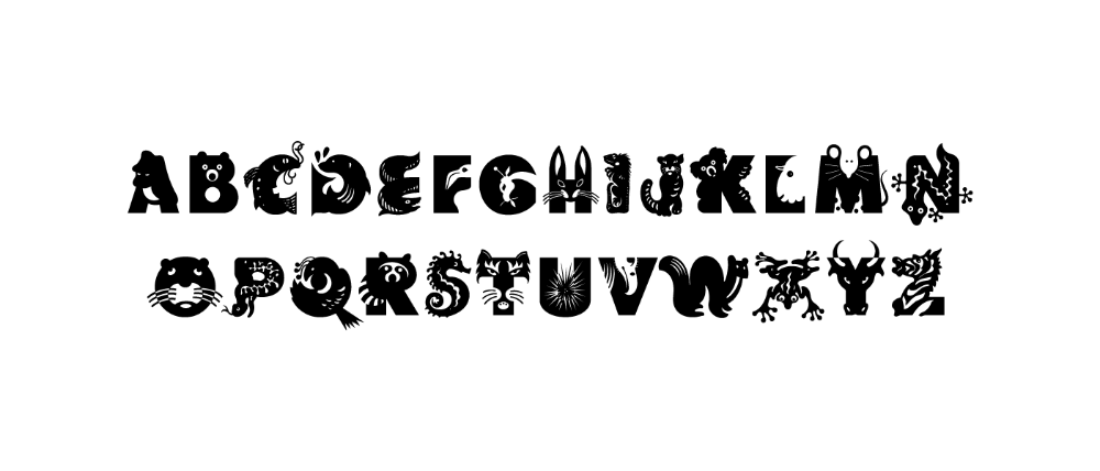
Typography is no longer confined to the rigid boundaries of legibility and aesthetics—it has evolved into a dynamic medium that breathes life into the inanimate. Among the most intriguing trends reshaping the typographic landscape is anthropomorphism, the attribution of human characteristics to non-human entities. This phenomenon is not merely a stylistic flourish; it is a radical reimagining of how we perceive and interact with text. As designers push the boundaries of form and function, the question lingers: Does anthropomorphism in typography truly work? To answer this, we must dissect its psychological underpinnings, aesthetic potential, and practical applications, all while considering whether it transcends novelty to deliver meaningful communication.
The Psychology Behind Giving Type a Human Face
At its core, anthropomorphism in typography exploits a fundamental cognitive bias—the human tendency to anthropomorphize objects, imbuing them with emotions, intentions, and even personalities. This psychological phenomenon, rooted in our evolutionary history, allows us to relate to the world around us on a deeply personal level. When typography adopts human traits—whether through exaggerated curves mimicking a smile, jagged edges evoking tension, or asymmetrical forms suggesting instability—it triggers an immediate, subconscious response.
Studies in neuromarketing reveal that anthropomorphic designs can enhance emotional engagement, making messages more memorable and persuasive. Consider a sans-serif font with rounded terminals, reminiscent of a child’s handwriting. The softness of its strokes subconsciously conveys warmth and approachability, while a sharp, angular serif might evoke authority or urgency. These associations are not arbitrary; they are hardwired into our perceptual framework, shaped by years of cultural conditioning and biological predisposition. By leveraging this innate tendency, typography transcends its utilitarian role, becoming a silent yet potent communicator of emotion.
From Static Letters to Expressive Characters
The shift from static glyphs to dynamic, anthropomorphic forms represents a paradigm shift in typographic design. Traditional typefaces adhere to strict geometric rules, prioritizing clarity and consistency. Anthropomorphism, however, introduces a fluidity that challenges these conventions. Designers now experiment with variable fonts—typefaces that can morph in real-time—allowing letters to stretch, contort, or even “breathe” in response to context. This malleability transforms typography into an interactive experience, where the text itself seems to react to the reader.
Take, for example, a brand logo that subtly alters its posture based on the user’s interaction. A playful script might elongate its ascenders when hovered over, mimicking a stretch, while a bold display face could tighten its spacing to convey tension. These micro-interactions create a sense of intimacy, as if the text is engaging in a silent dialogue with the audience. The result is a typographic ecosystem where letters are no longer passive carriers of information but active participants in the narrative.

Yet, this expressiveness comes with risks. Overindulgence in anthropomorphic traits can lead to visual cacophony, where the message is lost in the spectacle. The key lies in restraint—using anthropomorphism as a subtle accent rather than a dominant feature. When executed thoughtfully, it can elevate a design from merely functional to unforgettable.
The Aesthetic Allure: Why We’re Drawn to Humanized Type
Anthropomorphism in typography taps into a universal aesthetic principle: the uncanny valley. This phenomenon, where objects closely resembling humans elicit both fascination and unease, explains why we are irresistibly drawn to typography that walks the line between abstraction and humanity. A font that is almost human—with eyes where counters should be, or limbs extending from letterforms—creates a cognitive dissonance that commands attention.
This aesthetic pull is evident in the resurgence of vintage-inspired typefaces that mimic handwritten scripts or calligraphic flourishes. These designs evoke nostalgia, as if the text was penned by a long-lost friend. Similarly, grotesque and humanist sans-serifs often incorporate subtle anthropomorphic cues, such as asymmetrical bowls or tilted stems, to inject personality into otherwise neutral forms. The effect is disarming; we find ourselves anthropomorphizing the type before we even realize it.
Moreover, anthropomorphic typography aligns with contemporary design trends that prioritize authenticity and relatability. In an era dominated by digital interfaces and sterile sans-serifs, the injection of organic, human-like qualities feels like a breath of fresh air. It humanizes technology, making it feel less intimidating and more approachable. For brands, this can translate into stronger emotional connections with audiences, fostering loyalty and engagement.
Practical Applications: Where Anthropomorphism Thrives
While the theoretical appeal of anthropomorphic typography is undeniable, its true test lies in practical application. Where does this approach yield tangible results, and where does it falter? The answer depends on context, audience, and intent.
In branding and advertising, anthropomorphism can be a powerful tool for differentiation. A children’s brand, for instance, might employ rounded, bouncy letterforms to convey playfulness, while a luxury perfume could use elongated, flowing scripts to evoke elegance and sensuality. The typography becomes an extension of the brand’s personality, reinforcing its identity in the minds of consumers.
In user interface (UI) design, anthropomorphic typography can enhance usability by guiding the user’s attention. A loading animation where text “breathes” or “pulses” can make wait times feel more tolerable, while a form field that subtly shifts in weight when selected provides tactile feedback in a digital space. These micro-interactions reduce friction, making the user experience feel more intuitive and human.
However, in contexts where clarity and professionalism are paramount—such as legal documents or medical packaging—anthropomorphism can be a liability. Overly expressive typefaces may undermine credibility, leaving audiences skeptical or distracted. The challenge, then, is to strike a balance between personality and pragmatism, using anthropomorphism as a spice rather than the main course.
The Pitfalls: When Anthropomorphism Backfires
Not all experiments in anthropomorphic typography succeed. The line between charming and chaotic is perilously thin, and designers must tread carefully to avoid veering into the grotesque or the gimmicky. One common pitfall is over-sentimentality, where typography becomes so anthropomorphized that it loses its communicative function. A font that is too “cute” or “quirky” may fail to convey seriousness, rendering it unsuitable for professional contexts.
Another risk is cultural misinterpretation. Anthropomorphic cues that resonate in one culture may fall flat or even offend in another. For example, a font designed to mimic a smile might be perceived as insincere in cultures where direct eye contact is avoided. Designers must consider the cultural context of their audience, ensuring that their typographic choices align with local norms and expectations.
Accessibility is yet another concern. Highly stylized typography can pose challenges for readers with visual impairments or cognitive disabilities. Screen readers may struggle to interpret decorative elements, and dyslexic users might find overly complex letterforms difficult to parse. Inclusive design demands that anthropomorphism never come at the expense of usability, reinforcing the need for thoughtful, user-centered approaches.
The Future: A Typographic Renaissance
As technology advances, the potential for anthropomorphism in typography will only expand. Augmented reality (AR) and virtual reality (VR) present new frontiers where text can interact with users in three-dimensional spaces. Imagine a book cover where the title “whispers” when viewed through an AR app, or a navigation sign that “points” dynamically based on the viewer’s location. These innovations blur the line between typography and animation, opening up possibilities that were once confined to the realm of science fiction.
Moreover, the rise of generative AI is democratizing the creation of anthropomorphic typefaces. Designers can now use machine learning to generate fonts that evolve in real-time, adapting to user input or environmental factors. This could lead to a new era of personalized typography, where text feels uniquely tailored to each individual, further deepening the emotional connection between reader and message.
The future of typography lies not in its static perfection, but in its ability to adapt, emote, and engage. Anthropomorphism is more than a trend—it is a testament to the enduring human desire to see ourselves reflected in the world around us. Whether it “works” depends on how judiciously we wield this power, ensuring that our letters do not just speak, but feel.