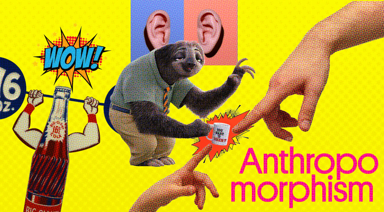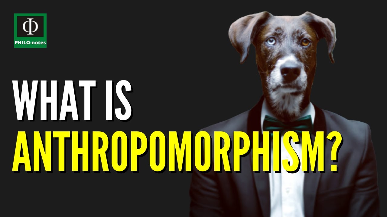
In the ever-evolving landscape of mobile app design, one concept has quietly emerged as a transformative force: anthropomorphism. By imbuing digital interfaces with human-like qualities, designers are not merely creating tools—they are crafting companions, guides, and even confidants. This subtle yet profound shift in perspective redefines user interaction, turning cold, static screens into dynamic, emotionally resonant experiences. But how does one harness this power without veering into the uncanny valley? The answer lies in a delicate balance of psychology, aesthetics, and narrative finesse.
The Psychology Behind Anthropomorphism: Why Users Crave Human-Like Interfaces
At its core, anthropomorphism taps into a fundamental human instinct—the tendency to attribute human characteristics to non-human entities. This cognitive bias, rooted in our evolutionary past, allows us to navigate complex systems by framing them in familiar terms. When a mobile app greets users with a warm, conversational tone or responds to errors with empathetic messaging, it doesn’t just communicate—it connects. Studies in human-computer interaction reveal that interfaces with anthropomorphic elements can reduce user frustration, enhance trust, and even boost engagement. The key lies in subtlety; overtly human-like designs risk feeling gimmicky, while carefully curated traits foster a sense of camaraderie.
Consider the humble progress bar. A static, rectangular indicator is functional but forgettable. Now imagine it as a gentle pulse, accompanied by a soft chime—an auditory cue that mimics a heartbeat. Suddenly, the app feels alive, its rhythm syncing with the user’s anticipation. This isn’t just visual polish; it’s a psychological bridge, transforming a mechanical process into a shared experience. The lesson? Anthropomorphism isn’t about mimicry; it’s about resonance.
From Metaphors to Manifestations: Crafting Personas for Your App
Every anthropomorphic design begins with a question: Who—or what—is this app to its users? The answer shapes everything from micro-interactions to macro-architecture. A fitness app, for instance, might adopt the persona of a stern but encouraging coach, its notifications peppered with phrases like “You’ve got this!” Conversely, a meditation app could embody a serene guide, its interface bathed in calming blues and whispers of reassurance. The challenge lies in consistency; a persona that shifts unpredictably erodes trust faster than a glitchy animation.
To avoid this pitfall, designers often turn to archetypes—universal character templates that resonate across cultures. The “Mentor” persona, for example, thrives in educational apps, offering wisdom without condescension. The “Companion” persona, seen in habit-tracking apps, feels like a loyal friend, celebrating milestones with understated enthusiasm. The trick is to select an archetype that aligns with the app’s core purpose while leaving room for nuance. A banking app personified as a “Guardian” might use protective imagery and reassuring language, whereas one framed as a “Collaborator” could adopt a more egalitarian tone, inviting users to co-create their financial journey.
The Visual Lexicon: Subtle Cues That Speak Volumes
Anthropomorphism isn’t confined to text; it thrives in the visual language of an app. Rounded corners, organic shapes, and fluid animations can evoke warmth and approachability, while sharp edges and rigid grids feel clinical and distant. Even typography plays a role—rounded, friendly fonts like Comic Sans (when used judiciously) can humanize an interface, while sleek, geometric typefaces project precision and authority. The goal isn’t to abandon modernist principles but to infuse them with humanity.
Micro-interactions serve as the app’s micro-personality quirks. A “like” button that blooms with a subtle heartbeat animation feels more alive than a static icon. A loading spinner that morphs into a playful doodle keeps users engaged during delays. Even color choices can whisper anthropomorphic traits: warm hues like coral or amber suggest friendliness, while cooler tones like teal or lavender evoke calmness. The trick is to weave these elements into a cohesive visual narrative—one that feels intentional, not arbitrary.
Voice and Tone: The Unseen Thread That Binds
A well-designed app doesn’t just look human; it sounds human. The voice of an interface—its tone, vocabulary, and cadence—can elevate it from a tool to a trusted ally. A banking app might adopt a reassuring, paternal tone (“We’ve got your back”), while a social media platform could feel more like a witty friend (“Oops! That post didn’t quite land—want to try again?”). The key is to match the voice to the user’s emotional state and the app’s purpose. Humor, when used sparingly, can disarm users; empathy can turn frustration into loyalty.
Consider error messages. A generic “Error 404” is forgettable. A playful “Oops! The page took a coffee break” is memorable. But anthropomorphism isn’t just about levity; it’s about context. A medical app, for instance, might use a gentle, clinical tone (“We’re here to help—let’s try that again”) to balance reassurance with professionalism. The voice should feel like a natural extension of the persona, reinforcing the app’s role in the user’s life.
Ethical Anthropomorphism: Avoiding the Uncanny Valley
While the allure of anthropomorphism is undeniable, it’s not without risks. Overdoing it can plunge an app into the uncanny valley—a psychological phenomenon where designs that are almost, but not quite, human feel unsettling. A chatbot with exaggerated facial expressions or a voice assistant that mimics human breathing too closely can trigger discomfort rather than connection. The solution lies in restraint. Subtle cues—like a friendly avatar that nods in response to user actions or a voice that conveys warmth without mimicking a human exactly—strike the right balance.
Another ethical consideration is inclusivity. Anthropomorphic designs must avoid reinforcing stereotypes or excluding users who may not relate to certain personas. For example, a “helpful assistant” persona might unintentionally alienate users who prefer direct, no-nonsense interactions. The solution is to offer customization—letting users choose their preferred tone, from formal to casual, or even opt out of anthropomorphic elements entirely. After all, the goal isn’t to impose a personality but to invite users into a dialogue.
Case Studies: Apps That Nail Anthropomorphic Design

Neumorphism in Action: Apps like those employing neumorphic design principles use soft shadows and minimal depth to create interfaces that feel almost tangible. The result? A tactile experience that mimics the way we interact with physical objects, fostering a sense of intimacy and control.
Conversational Interfaces: Apps like Duolingo and Headspace leverage anthropomorphism through animated characters that guide users, celebrate progress, and even crack jokes. These characters aren’t just decorative—they’re integral to the user’s journey, making learning and mindfulness feel like a shared adventure rather than a solitary task.
The Future: Where Anthropomorphism Meets AI
As artificial intelligence becomes more sophisticated, the line between anthropomorphic design and true AI companionship will blur. Imagine an app that doesn’t just respond to commands but anticipates needs, adapts its tone based on your mood, and even remembers personal anecdotes. The potential is staggering—but so are the ethical dilemmas. Will users embrace an app that feels almost sentient? Or will they recoil from designs that feel manipulative or intrusive?
The answer may lie in transparency. Users are increasingly savvy about AI’s limitations, and they respond better to interfaces that acknowledge their artificial nature while still delivering human-like warmth. A virtual assistant that says, “I’m still learning—thanks for your patience!” feels more trustworthy than one that pretends to be human. The future of anthropomorphism in mobile design isn’t about deception; it’s about collaboration—a partnership between user and interface, each playing to their strengths.
Conclusion: A Human Touch in a Digital World
Anthropomorphism in mobile app design is more than a trend; it’s a paradigm shift. By infusing interfaces with humanity, designers can transform mundane tasks into meaningful interactions, turning users into loyal advocates. But this power comes with responsibility. The most effective anthropomorphic designs are those that feel authentic, inclusive, and respectful of the user’s intelligence. They don’t shout for attention; they whisper, “I’m here to help.” In a world saturated with digital noise, that whisper can be the most compelling promise of all.
![Case Study: How [Company] Used Anthropomorphism to Redesign a Product](https://anthropomorphism.org/wp-content/uploads/2026/05/tnswcasestudy-100708061958-phpapp01-thumbnail.jpg)